Note
You can view & download the original notebook on Github.
Or, click here to run these notebooks on Coiled with access to Dask clusters.
Live visualization on a map
With stackstac.show or stackstac.add_to_map, you can display your data on an interactive ipyleaflet map within your notebook. As you pan and zoom, the portion of the dask array that’s in view is computed on the fly.
By running a Dask cluster colocated with the data, you can quickly aggregate hundreds of gigabytes of imagery on the backend, then only send a few megabytes of pixels back to your browser. This gives you a very simplified version of the Google Earth Engine development experience, but with much more flexibility.
Limitations
This functionality is still very much proof-of-concept, and there’s a lot to be improved in the future:
Doesn’t work well on large arrays. Sadly, loading a giant global DataArray and using the map to just view small parts of it won’t work—yet. Plan on only using an array of the area you actually want to look at (passing
bounds_latlon=tostackstac.stackhelps with this).Resolution doesn’t change as you zoom in or out.
Communication to Dask can be slow, or seem to hang temporarily.
[1]:
import stackstac
import satsearch
import ipyleaflet
import xarray as xr
import IPython.display as dsp
[2]:
import coiled
import distributed
You definitely will need a cluster near the data for this (or to run on a beefy VM in us-west-2).
You can sign up for a Coiled account and run clusters for free at https://cloud.coiled.io/ — no credit card or username required, just sign in with your GitHub or Google account.
[3]:
cluster = coiled.Cluster(
    name="stackstac",
    software="gjoseph92/stackstac",
    n_workers=22,
    scheduler_cpu=2,
    backend_options={"region": "us-west-2"},
)
client = distributed.Client(cluster)
client
Found software environment build
/Users/gabe/Library/Caches/pypoetry/virtualenvs/stackstac-FdRcOknL-py3.8/lib/python3.8/site-packages/distributed/client.py:1140: VersionMismatchWarning: Mismatched versions found

+---------+---------------+---------------+---------------+
| Package | client        | scheduler     | workers       |
+---------+---------------+---------------+---------------+
| python  | 3.8.7.final.0 | 3.8.8.final.0 | 3.8.8.final.0 |
+---------+---------------+---------------+---------------+
  warnings.warn(version_module.VersionMismatchWarning(msg[0]["warning"]))
[3]:
Client
|
Cluster
|
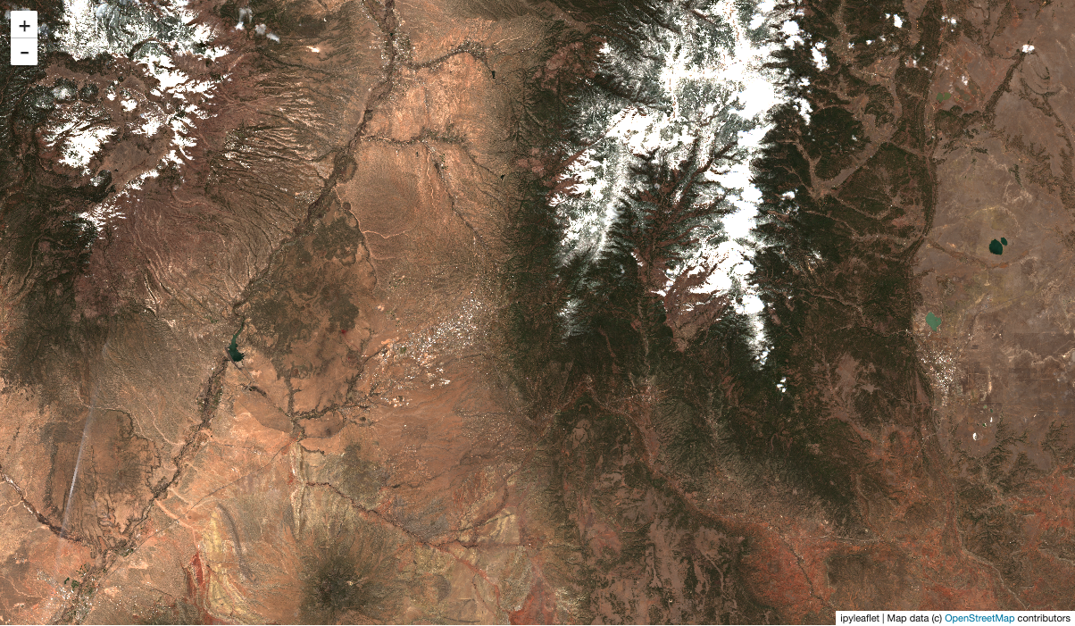
Search for Sentinel-2 data overlapping our map
[ ]:
m = ipyleaflet.Map()
m.center = 35.677153763176115, -105.8485489524901
m.zoom = 10
m.layout.height = "700px"
m
[5]:
%%time
bbox=[m.west, m.south, m.east, m.north]
stac_items = satsearch.Search(
    url="https://earth-search.aws.element84.com/v0",
    bbox=bbox,
    collections=["sentinel-s2-l2a-cogs"],
    datetime="2020-04-01/2020-04-15"
).items()
len(stac_items)
CPU times: user 65.1 ms, sys: 8.61 ms, total: 73.7 ms
Wall time: 4.08 s
[5]:
24
[ ]:
dsp.GeoJSON(stac_items.geojson())
Create the time stack
Important: the resolution you pick here is what the map will use, regardless of zoom level! When you zoom in/out on the map, the data won’t be loaded at lower or higher resolutions. (In the future, we hope to support this.)
Beware of zooming out on high-resolution data; you could trigger a massive amount of compute!
[7]:
%time stack = stackstac.stack(stac_items, resolution=80)
CPU times: user 14.7 ms, sys: 1.48 ms, total: 16.2 ms
Wall time: 15.1 ms
Persist the data we want to view
By persisting all the RGB data, Dask will pre-load it and store it in memory, ready to use. That way, we can tweak what we show on the map (different composite operations, scaling, etc.) without having to re-fetch the original data every time. It also means tiles will load much faster as we pan around, since they’re already mostly computed.
It’s generally a good idea to persist somewhere before stackstac.show. Typically you’d do this after a reduction step (like a temporal composite), but our data here is small, so it doesn’t matter much.
As a rule of thumb, try to persist after the biggest, slowest steps of your analysis, but before the steps you might want to tweak (like thresholds, scaling, etc.). If you want to tweak your big slow steps, well… be prepared to wait (and maybe don’t persist).
[8]:
rgb = stack.sel(band=["B04", "B03", "B02"]).persist()
rgb
[8]:
<xarray.DataArray 'stackstac-abf58c56690c9d257a569f7ef9290c29' (time: 24, band: 3, y: 2624, x: 2622)>
dask.array<getitem, shape=(24, 3, 2624, 2622), dtype=float64, chunksize=(1, 1, 1024, 1024), chunktype=numpy.ndarray>
Coordinates: (12/24)
  * time                        (time) datetime64[ns] 2020-04-01T18:03:50 ......
    id                          (time) <U24 'S2B_13SDA_20200401_0_L2A' ... 'S...
  * band                        (band) <U8 'B04' 'B03' 'B02'
  * x                           (x) float64 3e+05 3.001e+05 ... 5.097e+05
  * y                           (y) float64 4.1e+06 4.1e+06 ... 3.89e+06
    view:off_nadir              int64 0
    ...                          ...
    sentinel:sequence           <U1 '0'
    sentinel:data_coverage      (time) float64 58.22 100.0 33.85 ... 100.0 42.69
    data_coverage               (time) float64 58.22 100.0 33.85 ... 100.0 42.69
    created                     (time) <U24 '2020-09-05T12:39:12.865Z' ... '2...
    title                       (band) object 'Band 4 (red)' ... 'Band 2 (blue)'
    epsg                        int64 32613
Attributes:
    spec:        RasterSpec(epsg=32613, bounds=(300000, 3890160, 509760, 4100...
    crs:         epsg:32613
    transform:   | 80.00, 0.00, 300000.00|\n| 0.00,-80.00, 4100080.00|\n| 0.0...
resolution: 80- time: 24
- band: 3
- y: 2624
- x: 2622
- dask.array<chunksize=(1, 1, 1024, 1024), meta=np.ndarray>
Array Chunk Bytes 3.69 GiB 8.00 MiB Shape (24, 3, 2624, 2622) (1, 1, 1024, 1024) Count 648 Tasks 648 Chunks Type float64 numpy.ndarray - time(time)datetime64[ns]2020-04-01T18:03:50 ... 2020-04-...
array(['2020-04-01T18:03:50.000000000', '2020-04-01T18:03:54.000000000', '2020-04-01T18:04:04.000000000', '2020-04-01T18:04:08.000000000', '2020-04-03T17:53:53.000000000', '2020-04-03T17:53:57.000000000', '2020-04-03T17:54:07.000000000', '2020-04-03T17:54:10.000000000', '2020-04-06T18:03:49.000000000', '2020-04-06T18:03:53.000000000', '2020-04-06T18:04:04.000000000', '2020-04-06T18:04:08.000000000', '2020-04-08T17:53:53.000000000', '2020-04-08T17:53:57.000000000', '2020-04-08T17:54:08.000000000', '2020-04-08T17:54:11.000000000', '2020-04-11T18:03:49.000000000', '2020-04-11T18:03:53.000000000', '2020-04-11T18:04:03.000000000', '2020-04-11T18:04:07.000000000', '2020-04-13T17:53:56.000000000', '2020-04-13T17:54:00.000000000', '2020-04-13T17:54:10.000000000', '2020-04-13T17:54:13.000000000'], dtype='datetime64[ns]') - id(time)<U24'S2B_13SDA_20200401_0_L2A' ... '...
array(['S2B_13SDA_20200401_0_L2A', 'S2B_13SCA_20200401_0_L2A', 'S2B_13SDV_20200401_0_L2A', 'S2B_13SCV_20200401_0_L2A', 'S2A_13SDA_20200403_0_L2A', 'S2A_13SCA_20200403_0_L2A', 'S2A_13SDV_20200403_0_L2A', 'S2A_13SCV_20200403_0_L2A', 'S2A_13SDA_20200406_0_L2A', 'S2A_13SCA_20200406_0_L2A', 'S2A_13SDV_20200406_0_L2A', 'S2A_13SCV_20200406_0_L2A', 'S2B_13SDA_20200408_0_L2A', 'S2B_13SCA_20200408_0_L2A', 'S2B_13SDV_20200408_0_L2A', 'S2B_13SCV_20200408_0_L2A', 'S2B_13SDA_20200411_0_L2A', 'S2B_13SCA_20200411_0_L2A', 'S2B_13SDV_20200411_0_L2A', 'S2B_13SCV_20200411_0_L2A', 'S2A_13SDA_20200413_0_L2A', 'S2A_13SCA_20200413_0_L2A', 'S2A_13SDV_20200413_0_L2A', 'S2A_13SCV_20200413_0_L2A'], dtype='<U24') - band(band)<U8'B04' 'B03' 'B02'
array(['B04', 'B03', 'B02'], dtype='<U8')
- x(x)float643e+05 3.001e+05 ... 5.097e+05
array([300000., 300080., 300160., ..., 509520., 509600., 509680.])
- y(y)float644.1e+06 4.1e+06 ... 3.89e+06
array([4100080., 4100000., 4099920., ..., 3890400., 3890320., 3890240.])
- view:off_nadir()int640
array(0)
- sentinel:product_id(time)<U60'S2B_MSIL2A_20200401T174909_N021...
array(['S2B_MSIL2A_20200401T174909_N0214_R141_T13SDA_20200401T220155', 'S2B_MSIL2A_20200401T174909_N0214_R141_T13SCA_20200401T220155', 'S2B_MSIL2A_20200401T174909_N0214_R141_T13SDV_20200401T220155', 'S2B_MSIL2A_20200401T174909_N0214_R141_T13SCV_20200401T220155', 'S2A_MSIL2A_20200403T173901_N0214_R098_T13SDA_20200403T220105', 'S2A_MSIL2A_20200403T173901_N0214_R098_T13SCA_20200403T220105', 'S2A_MSIL2A_20200403T173901_N0214_R098_T13SDV_20200403T220105', 'S2A_MSIL2A_20200403T173901_N0214_R098_T13SCV_20200403T220105', 'S2A_MSIL2A_20200406T174901_N0214_R141_T13SDA_20200406T221027', 'S2A_MSIL2A_20200406T174901_N0214_R141_T13SCA_20200406T221027', 'S2A_MSIL2A_20200406T174901_N0214_R141_T13SDV_20200406T221027', 'S2A_MSIL2A_20200406T174901_N0214_R141_T13SCV_20200406T221027', 'S2B_MSIL2A_20200408T173859_N0214_R098_T13SDA_20200408T215856', 'S2B_MSIL2A_20200408T173859_N0214_R098_T13SCA_20200408T215856', 'S2B_MSIL2A_20200408T173859_N0214_R098_T13SDV_20200408T215856', 'S2B_MSIL2A_20200408T173859_N0214_R098_T13SCV_20200408T215856', 'S2B_MSIL2A_20200411T174909_N0214_R141_T13SDA_20200411T220443', 'S2B_MSIL2A_20200411T174909_N0214_R141_T13SCA_20200411T220443', 'S2B_MSIL2A_20200411T174909_N0214_R141_T13SDV_20200411T220443', 'S2B_MSIL2A_20200411T174909_N0214_R141_T13SCV_20200411T220443', 'S2A_MSIL2A_20200413T173901_N0214_R098_T13SDA_20200413T235616', 'S2A_MSIL2A_20200413T173901_N0214_R098_T13SCA_20200413T235616', 'S2A_MSIL2A_20200413T173901_N0214_R098_T13SDV_20200413T235616', 'S2A_MSIL2A_20200413T173901_N0214_R098_T13SCV_20200413T235616'], dtype='<U60') - proj:epsg()int6432613
array(32613)
- constellation()<U10'sentinel-2'
array('sentinel-2', dtype='<U10') - instruments()<U3'msi'
array('msi', dtype='<U3') - platform(time)objectNone None ... 'sentinel-2a'
array([None, None, None, 'sentinel-2b', 'sentinel-2a', 'sentinel-2a', 'sentinel-2a', 'sentinel-2a', 'sentinel-2a', 'sentinel-2a', 'sentinel-2a', 'sentinel-2a', 'sentinel-2b', 'sentinel-2b', 'sentinel-2b', 'sentinel-2b', 'sentinel-2b', 'sentinel-2b', 'sentinel-2b', 'sentinel-2b', 'sentinel-2a', 'sentinel-2a', 'sentinel-2a', 'sentinel-2a'], dtype=object) - eo:cloud_cover(time)float6427.36 28.71 29.24 ... 100.0 100.0
array([ 27.36, 28.71, 29.24, 42.53, 12.33, 7.4 , 1.16, 1.58, 2.09, 1.01, 27.26, 15.75, 2.74, 0.53, 1.15, 0.11, 15.67, 11.07, 9.37, 17.83, 99.96, 99.97, 100. , 100. ]) - gsd()int6410
array(10)
- sentinel:latitude_band()<U1'S'
array('S', dtype='<U1') - sentinel:grid_square(time)<U2'DA' 'CA' 'DV' ... 'CA' 'DV' 'CV'
array(['DA', 'CA', 'DV', 'CV', 'DA', 'CA', 'DV', 'CV', 'DA', 'CA', 'DV', 'CV', 'DA', 'CA', 'DV', 'CV', 'DA', 'CA', 'DV', 'CV', 'DA', 'CA', 'DV', 'CV'], dtype='<U2') - updated(time)<U24'2020-09-05T12:39:12.865Z' ... '...
array(['2020-09-05T12:39:12.865Z', '2020-09-05T06:24:19.862Z', '2020-09-05T06:23:47.836Z', '2020-09-18T23:33:57.593Z', '2020-09-05T10:35:08.576Z', '2020-09-18T22:58:28.920Z', '2020-09-23T15:43:10.502Z', '2020-08-31T15:57:36.461Z', '2020-09-19T03:48:23.504Z', '2020-09-05T10:00:19.229Z', '2020-09-05T11:18:48.722Z', '2020-08-31T15:12:49.407Z', '2020-08-31T15:02:43.771Z', '2020-09-19T00:17:08.540Z', '2020-08-31T15:23:56.855Z', '2020-09-05T12:50:14.783Z', '2020-09-23T09:12:42.490Z', '2020-09-18T23:11:12.399Z', '2020-09-23T16:16:43.693Z', '2020-09-23T09:09:25.619Z', '2020-09-19T01:38:56.112Z', '2020-09-19T10:28:14.469Z', '2020-09-24T06:31:45.567Z', '2020-09-19T03:49:30.360Z'], dtype='<U24') - sentinel:valid_cloud_cover()boolTrue
array(True)
- sentinel:utm_zone()int6413
array(13)
- sentinel:sequence()<U1'0'
array('0', dtype='<U1') - sentinel:data_coverage(time)float6458.22 100.0 33.85 ... 100.0 42.69
array([ 58.22, 100. , 33.85, 100. , 99.97, 19.96, 100. , 42.12, 58.36, 100. , 33.9 , 100. , 99.99, 20.36, 100. , 42.4 , 58.27, 100. , 33.87, 100. , 99.99, 20.57, 100. , 42.69]) - data_coverage(time)float6458.22 100.0 33.85 ... 100.0 42.69
array([ 58.22, 100. , 33.85, 100. , 99.97, 19.96, 100. , 42.12, 58.36, 100. , 33.9 , 100. , 99.99, 20.36, 100. , 42.4 , 58.27, 100. , 33.87, 100. , 99.99, 20.57, 100. , 42.69]) - created(time)<U24'2020-09-05T12:39:12.865Z' ... '...
array(['2020-09-05T12:39:12.865Z', '2020-09-05T06:24:19.862Z', '2020-09-05T06:23:47.836Z', '2020-09-18T23:33:57.593Z', '2020-09-05T10:35:08.576Z', '2020-09-18T22:58:28.920Z', '2020-09-23T15:43:10.502Z', '2020-08-31T15:57:36.461Z', '2020-09-19T03:48:23.504Z', '2020-09-05T10:00:19.229Z', '2020-09-05T11:18:48.722Z', '2020-08-31T15:12:49.407Z', '2020-08-31T15:02:43.771Z', '2020-09-19T00:17:08.540Z', '2020-08-31T15:23:56.855Z', '2020-09-05T12:50:14.783Z', '2020-09-23T09:12:42.490Z', '2020-09-18T23:11:12.399Z', '2020-09-23T16:16:43.693Z', '2020-09-23T09:09:25.619Z', '2020-09-19T01:38:56.112Z', '2020-09-19T10:28:14.469Z', '2020-09-24T06:31:45.567Z', '2020-09-19T03:49:30.360Z'], dtype='<U24') - title(band)object'Band 4 (red)' ... 'Band 2 (blue)'
array(['Band 4 (red)', 'Band 3 (green)', 'Band 2 (blue)'], dtype=object)
- epsg()int6432613
array(32613)
- spec :
- RasterSpec(epsg=32613, bounds=(300000, 3890160, 509760, 4100080), resolutions_xy=(80, 80))
- crs :
- epsg:32613
- transform :
- | 80.00, 0.00, 300000.00| | 0.00,-80.00, 4100080.00| | 0.00, 0.00, 1.00|
- resolution :
- 80
stackstac.add_to_map
stackstac.add_to_map displays a DataArray on an existing ipyleaflet map. You give it a layer name—if a layer with this name already exists, it’s replaced; otherwise, it’s added. This is nice for working in notebooks, since you can re-run an add_to_map cell to adjust it, without piling up new layers.
Before continuing, you should open the distributed dashboard in another window (or use the dask-jupyterlab extension) in order to watch its progress.
[ ]:
m.zoom = 10
m
Static screenshot for docs (delete this cell if running the notebook):
stackstac.server_stats is a widget showing some under-the-hood stats about the computations currently running to generate your tiles. It shows “work bars”—like the inverse of progress bars—indicating the tasks it’s currently waiting on.
[ ]:
stackstac.server_stats
Make a temporal median composite, and show that on the map m above! Pan around and notice how the dask dashboard shows your progress.
[11]:
comp = rgb.median("time")
stackstac.add_to_map(comp, m, "s2", range=[0, 3000])
Try changing median to mean, min, max, etc. in the cell above, and re-run. The map will update with the new layer contents (since you reused the name "s2").
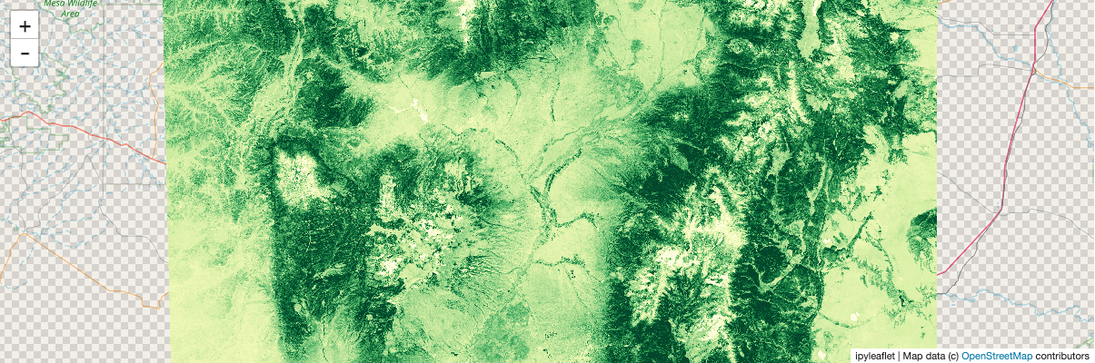
Showing computed values
You can display anything you can compute with dask and xarray, not just raw data. Here, we’ll compute NDVI (Normalized Difference Vegetation Index), which indicates the health of vegetation (and is kind of a “hello world” example for remote sensing).
[12]:
nir, red = stack.sel(band="B08"), stack.sel(band="B04")
ndvi = (nir - red) / (nir + red)
ndvi = ndvi.persist()
We’ll show the temporal maximum NDVI (try changing to min, median, etc.)
[13]:
ndvi_comp = ndvi.max("time")
stackstac.show
stackstac.show creates a new map for you, centers it on your array, and displays it. It’s very convenient.
[ ]:
stackstac.show(ndvi_comp, range=(0, 0.6), cmap="YlGn")
Static screenshot for docs (delete this cell if running the notebook):
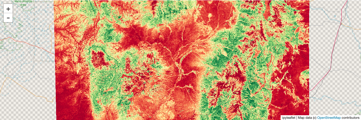
To demonstrate more derived quantities: show each pixel’s deviation from the mean NDVI of the whole array:
[16]:
anomaly = ndvi_comp - ndvi.mean()
[ ]:
stackstac.show(anomaly, cmap="RdYlGn")
Static screenshot for docs (delete this cell if running the notebook):
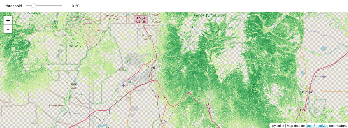
Interactively explore data with widgets
Using ipywidgets.interact, you can interactively threshold the NDVI values by adjusting a slider. It’s a bit clunky, and pretty slow to refresh, but still a nice demonstration of the powerful tools that become available by integrating with the Python ecosystem.
[ ]:
import ipywidgets

ndvi_map = ipyleaflet.Map()
ndvi_map.center = m.center
ndvi_map.zoom = m.zoom

@ipywidgets.interact(threshold=(0.0, 1.0, 0.1))
def explore_ndvi(threshold=0.2):
    high_ndvi = ndvi_comp.where(ndvi_comp > threshold)
    stackstac.add_to_map(high_ndvi, ndvi_map, "ndvi", range=[0, 1], cmap="YlGn")
    return ndvi_map
Static screenshot for docs (delete this cell if running the notebook):